So far in 2021, we have covered numerous topics since the Quantum Foresight Platform was launched in January 2021. In February 2021, we discussed the Platform’s various content types and learned about Lists in March 2021. The basics of the Scenario Composer were discussed in April 2021, and in May 2021, we reviewed the different features of the Strategy Planner.
This month—June 2021—we are learning about the Scenario Composer project interface’s different features. As we learned in April, the Scenario Composer project interface helps organizations visualize the trend content they bookmarked into a circular graph that can segment their List’s trend content using nearly two dozen variables, in hundreds of possible variations.

Project page elements in detail
Below we will detail the various features present in the Scenario Composer project type that your organization can take advantage of for your planning objectives.
Left sidebar
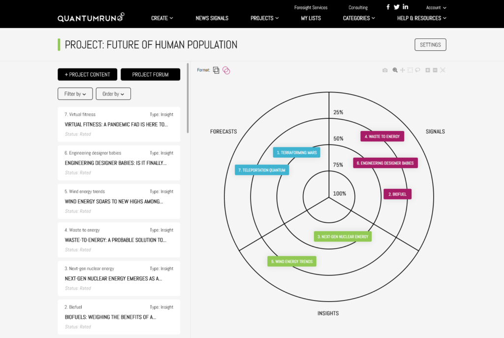
Posts: The primary content in this left sidebar will be a scrollable list of all the content your team tagged/bookmarked to the List this project page was created with and/or all the content your team custom created using the publishing tools found on this page.
Each row of content will display its: Micro title field (top-left corner); Content type (top-right); Full post title; Status (bottom-left: states include ‘Rated’ or ‘Pending’)
“+PROJECT CONTENT” button: During the process of creating a new project page (view instructions here), you have the option of pre-populating your project with bookmarked content from a list or starting a clean project that you can populate with your own content. In either case, your team can publish your own internal or externally sourced website links/URLs or articles/reports by clicking on the “+PROJECT CONTENT” button on the top left corner of the project page’s left sidebar. This dropdown button will open a popup form that will allow you to publish your own content to this project. Read details here.
“PROJECT FORUM” button: Located beside the “+PROJECT CONTENT”, this button will open a Project-specific forum where team members collaborating on this project can share notes, opinions, comments, etc.
Filter options
Thus far, we have enabled the ability to filter content by year range, probability range, impact range, content tags, publish date, content owner, and more in development.
‘Filter by dropdown’: Clicking on this dropdown will open up a popup over the project graph that will display the various options available to filter the left sidebar content list and in so doing, filter the content displayed in the visualization graph on the right portion of the page.
‘Order by’ dropdown: Selecting an option from this dropdown will reorder the content list in the left sidebar using a variety of criteria, including: Rated first (ordering posts by whether they have been voted on by your team); Pending first (posts without votes); Content type; Probability (ordering posts with the highest average probability values above the ones will lower average values); Impact (ordering posts with the highest average impact values).
Project page visualization
The right portion of the project page features the Scenario Composer visualization. By default, it will (based on the votes collected/applied to each post) automatically position and display the posts inside a circular radar graph.
Using the ‘Filter by’ popup interface, your team can group, divide, and visualize the content listed on the left sidebar across a wide range of categories and voting criteria.
This visualization interface allows organizations to create a large number of comprehensive business scenarios that can make them ready—prepared—for whatever the market throws at them.
On the top-left corner of the graph:

You will see an option to change the format from displaying the left sidebar posts as circles (showing their numbers) or as bars (showing their micro titles).
Meanwhile, on the top-right corner of the graph:

You will see a variety of tools to download a screenshot of your visualization, to zoom in and out, or zoom in on a specific section of the graph, and to reset the graph to its original dimensions. More tools may be added based on user feedback.
Project page menu
Above the project page elements described above:
![]()
You will see the project page’s title, as well as the “SETTINGS” button that will allow you to edit various project page settings. You can learn more here.
That is going to wrap up our review of the Scenario Composer’s different features. In July 2021, we will introduce the Ideation Engine project interface.
If you want to know more about signing up to the Quantumrun Foresight Platform and its different pricing plans, speak to us at contact@quantumrun.com. One of our Foresight consultants will contact you to find out how best the Quantumrun Foresight Platform can serve the needs of your business.
You can also schedule a live demo of the platform, or test the Platform over a trial period.


